[1]:
%matplotlib widget
Plots and interfaces
In this section, we review the visual aids provided by  , as well as, some tips on how to adjust them to your workflow. If you have any issues with visualizing your data with , please contact the author or open an issue.
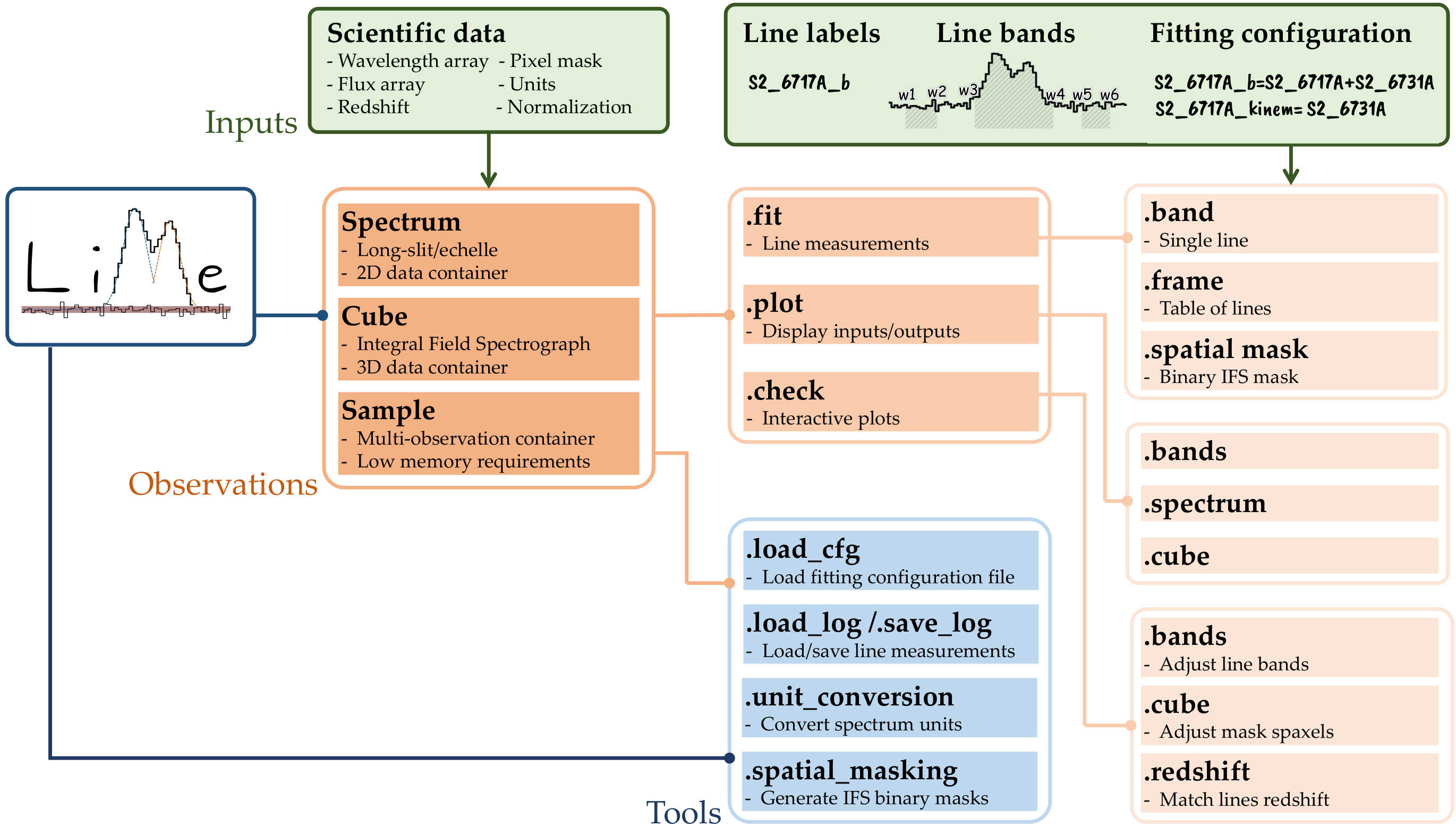
LiMe features a composite software design, utilizing instances of other classes to implement its desired functionality. This approach is akin to that of IRAF: Functions are organized into multi-level packages, which users access to perform the desired operations. The diagram in Fig.1 outlines this workflow.
As you can see there are two kind of plots * The functions under the .plot attribute are standard matplotlib plots. By default the plots will be displayed unless the user provides an output_address in which case the plot will be saved. * The functions under the .check attribute are interactive matplotlib plots. The user usually needs to provide an output_address where the new data selection is stored.
Adjusting the figures format
1) Plotting functions configuration
Let’s start by getting the data from the third tutorial:
[3]:
import lime

lime.theme.set_style(fig_cfg={"figure.dpi": 100})

# State the data files
obsFitsFile = '../sample_data/spectra/gp121903_osiris.fits'
lineBandsFile = '../sample_data/osiris_bands.txt'
cfgFile = '../sample_data/osiris.toml'

# Load configuration
obs_cfg = lime.load_cfg(cfgFile)
z_obj = obs_cfg['sample_data']['z_array'][2]
norm_flux = obs_cfg['sample_data']['norm_flux']

# Declare LiMe spectrum
gp_spec = lime.Spectrum.from_file(obsFitsFile, instrument='osiris', redshift=z_obj, norm_flux=norm_flux)
gp_spec.plot.spectrum(rest_frame=True)
In the .plot and .check functions you can use the fig_cfg and ax_cfg arguments to adjust the figure labels and format:
[8]:
ax_cfg = {'title': 'GP121903 osiris observation', 'ylabel':'Flux (FLAM)'}
fig_cfg = {"axes.titlesize" : 30, "figure.facecolor": "red", "axes.facecolor": "red"}
gp_spec.plot.spectrum(rest_frame=True, ax_cfg=ax_cfg, fig_cfg=fig_cfg)
2) Global configuration functions configuration
Additionally, you can adjust the overall format calling the lime.themer funtion:
[12]:
lime.theme.set_style(style='dark', fig_cfg={"axes.titlesize" : 30})

gp_spec.plot.spectrum(rest_frame=True, ax_cfg=ax_cfg)
3) Changing the default values
If you have access to the installation folder, you can change the default values for the figures format. This file is called config.toml and it should be located at:
[21]:
from lime.io import _LIME_FOLDER

print(_LIME_FOLDER/'config.toml')
/home/vital/PycharmProjects/lime/src/lime/config.toml
This file has a .toml format where the plotting parameters can be found on the matplotlib and colors sections:
[20]:
lime_cfg = lime.load_cfg(_LIME_FOLDER/'config.toml')
lime_cfg
[20]:
{'metadata': {'name': 'lime-stable', 'version': '0.9.99.9'},
 'lime_colors': {'default': {'bg': '#FFFFFF',
   'fg': '#000000',
   'cont_band': '#8c564b',
   'line_band': '#b5bd61',
   'color_cycle': ['#279e68',
    '#d62728',
    '#aa40fc',
    '#8c564b',
    '#e377c2',
    '#7f7f7f',
    '#b5bd61',
    '#17becf',
    '#1f77b4',
    '#ff7f0e'],
   'match_line': '#b5bd61',
   'peak': '#aa40fc',
   'trough': '#7f7f7f',
   'profile': '#1f77b4',
   'cont': '#ff7f0e',
   'error': '#FF0000',
   'mask_map': 'viridis',
   'comps_map': 'Dark2',
   'mask_marker': '#FF0000',
   'inspection_positive': '#FFFFFF',
   'inspection_negative': '#ff796c',
   'fade_fg': '#CCCCCC'},
  'dark': {'bg': '#2B2B2B',
   'fg': '#CCCCCC',
   'cont_band': '#e7298a',
   'line_band': '#8fff9f',
   'color_cycle': ['#66c2a5',
    '#fc8d62',
    '#e68ac3',
    '#a6d854',
    '#ffd92f',
    '#e5c494',
    '#8dcbe2',
    '#e7298a',
    '#332288',
    '#88ccee'],
   'match_line': '#8fff9f',
   'peak': '#aa40fc',
   'trough': '#7f7f7f',
   'profile': '#ddcc77',
   'cont': '#CCCCCC',
   'error': '#FF0000',
   'mask_map': 'viridis',
   'comps_map': 'PuRd',
   'mask_marker': '#FF0000',
   'inspection_positive': '#2B2B2B',
   'inspection_negative': '#840000',
   'fade_fg': '#73879B'}},
 'matplotlib': {'default': {'figure.dpi': 200,
   'figure.figsize': [8, 5],
   'axes.titlesize': 14,
   'axes.labelsize': 14,
   'legend.fontsize': 12,
   'xtick.labelsize': 13,
   'ytick.labelsize': 13},
  'high_res': {'figure.dpi': 300,
   'figure.figsize': [11, 6],
   'axes.titlesize': 14,
   'axes.labelsize': 14,
   'legend.fontsize': 12,
   'xtick.labelsize': 12,
   'ytick.labelsize': 12},
  'dark': {'figure.facecolor': '#2B2B2B',
   'axes.facecolor': '#2B2B2B',
   'axes.edgecolor': '#CCCCCC',
   'axes.labelcolor': '#CCCCCC',
   'xtick.labelcolor': '#CCCCCC',
   'ytick.labelcolor': '#CCCCCC',
   'xtick.color': '#CCCCCC',
   'ytick.color': '#CCCCCC',
   'text.color': '#CCCCCC',
   'legend.edgecolor': 'inherit',
   'legend.facecolor': 'inherit'},
  'bands': {'axes.labelsize': 14},
  'grid': {'axes.titlesize': 12},
  'cube_interactive': {'figure.figsize': [16, 8],
   'axes.titlesize': 12,
   'legend.fontsize': 12,
   'axes.labelsize': 12,
   'xtick.labelsize': 10,
   'ytick.labelsize': 10}}}
If you need to restore the default values from this file, you can find it in the github.
Jupyter notebooks and interactive shells
functions should work in any IDE (Integrated Developement Environment) including Jupyter Notebooks. This tutorial can be found as a notebook in the Github examples/outputs folder.
However, many of interactive plots cannot be easily used within a notebook even with the %matplotlib widgetcommand.
To get access to the matplotlib interactive tools you should include the magic command %matplotlib widgetat the begining of your notebook.
It is recommended to install the Pyqt library and use the %matplotlib qt. This will display the matplotlib plots in a new window making it easier to interact.